Avensys
Avensys are part of the VAMED international group of companies specialising in all areas of medical technology.
Established in 2007, Avensys started as a biomedical engineering repair and maintenance company. Now, they employ some of the best engineers in the UK and are widely regarded as an industry leader.
As an independent company, Avensys has focused on being reactive to the market and providing an excellent standard of service that neither the NHS nor private medical facilities can compete with.
However, their old website design didn’t match their excellent work. That’s when they turned to us for help and guidance.

The Brief
Avensys required a custom feature website design which aligned with their diverse range of service offerings and captured their innovative brand ethos.
The brief from Avensys was truly unique. Instead of asking for one or two features, the Kidderminster-based company wanted three challenging features built-in, including a video background on the homepage, a shopping store and event booking capability.
While Avensys old website already had shop and event booking features, the functionality was lacking and the layout ruined the user experience (UX).
The overall aesthetic needed a complete overhaul as well. Before, it contained uninspiring blocks of content and off-brand stock images.
As a leader in biomedical equipment engineering services, the website design didn’t match their stature in the marketplace. It was our job to design a custom feature website that instilled confidence into every user and made it easy for them to take action.
The Result
The custom feature website design for Avensys has garnered a long string of positive feedback regarding the UX and has also generated a healthy boost in organic traffic.
Building this custom feature website design required a lot of planning, development time and coding to ensure the functionality is of the best possible standard.
To cater for Avensys’ specific needs, we created a new layout for every single page. While this was extremely time-consuming, we’re absolutely delighted with the end product.
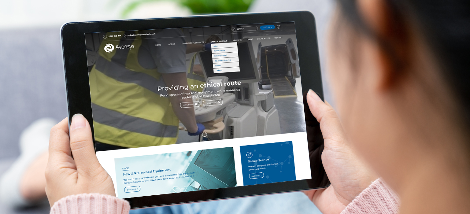
The video background on the homepage instantly helps tell their brand story. Despite their role as market-leaders in biomedical equipment engineering services, they wanted their company to feel approachable. Applying the video background helps users associate faces with the brand, which is a powerful tool for creating familiarity.
Avensys also wanted their new website design to act as an effective sales tool. For the Training section, every course required a page and a unique form for users to register their interest. While this wasn’t complicated, it did take a lot of time to code.
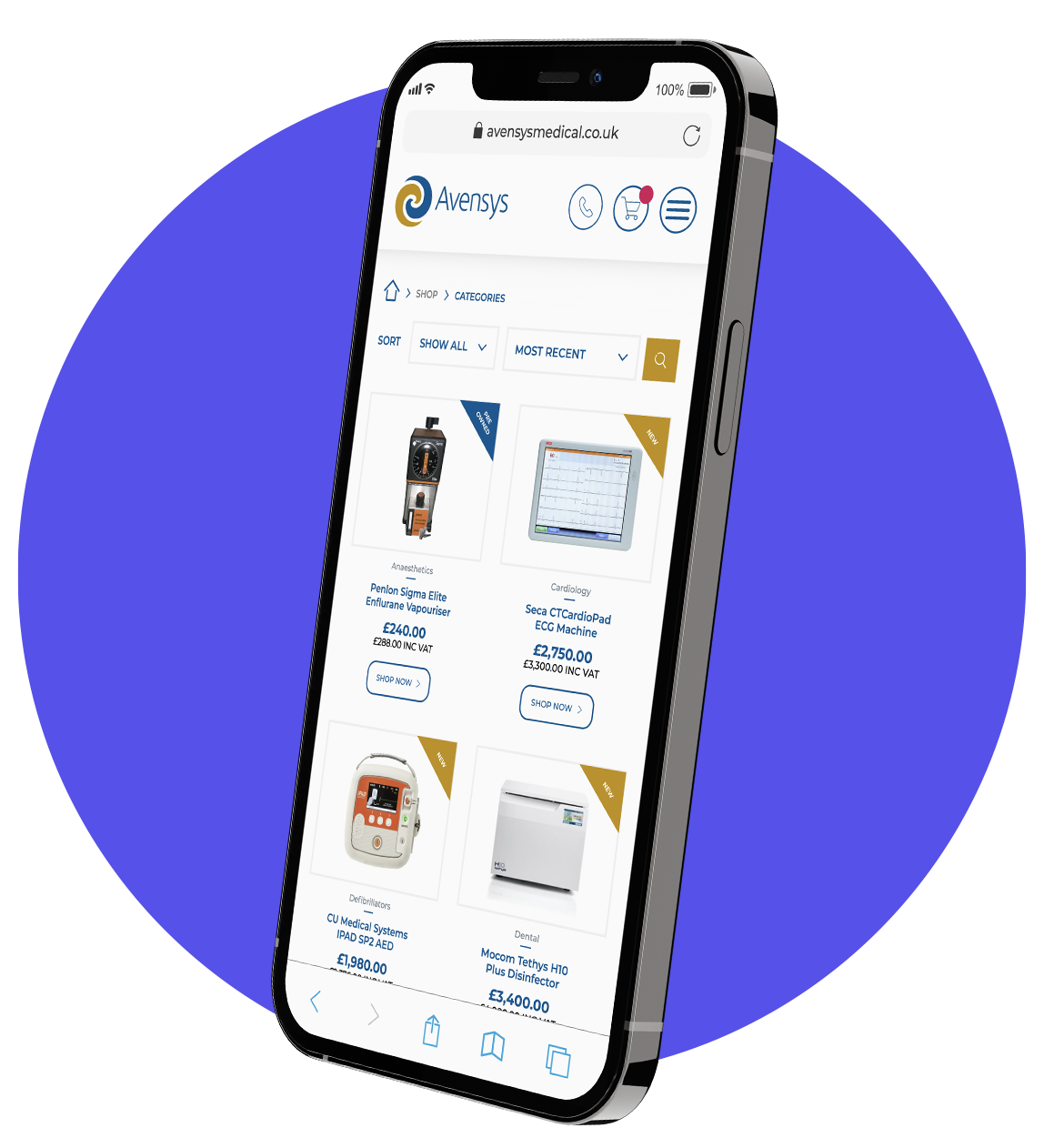
The Shop section was another challenging addition to help drive instant sales. Integrating the fundamentals of an e-commerce website within the framework of a custom feature website required significant back-end development and design resource.
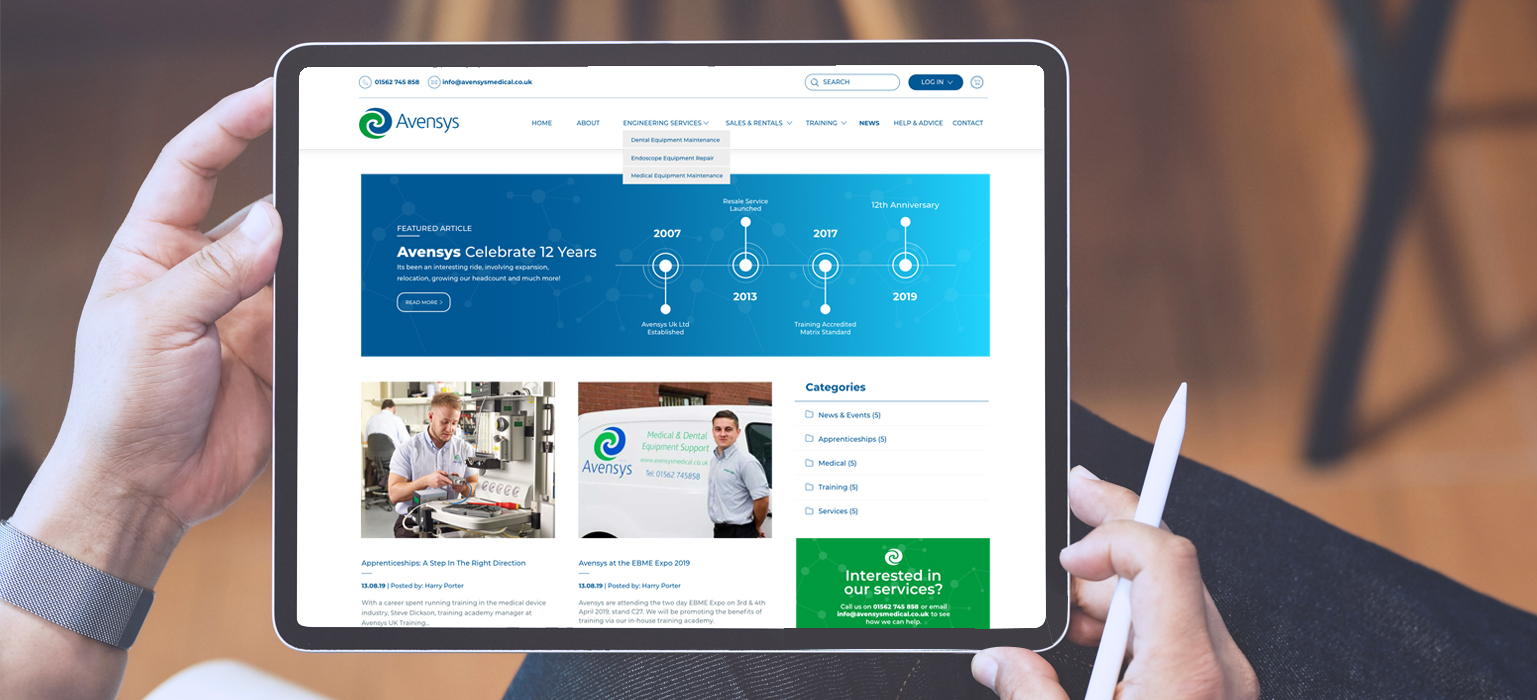
Our team worked on the overall aesthetic of the website too. Some notable elements include the use of space and incorporating block sections more sparingly to create a cleaner feel, as well as adding scrolling banners across the website to establish an integrated feel from page to page while enhancing the user experience.
Since the launch of the new website design, Avensys has already seen positive results – including more organic traffic and better engagement. Heat mapping also shows that visitors are exploring different pages which were often overlooked before.
Need help building a new ecommerce website?
If you need a new website design or integrating a new feature into your existing one, we’re here to help. Get in touch with us today by phoning 0121 389 3033 or emailing ideas@eighty3creative.co.uk. Follow us on Facebook, Instagram and LinkedIn.


